Monday, 4 July 2016

Flyer Design: Brilliant Examples You Can Learn From

We see them everyday — in the mail, at work or school, on community bulletin boards, in store windows. Flyers.


That’s right, those bits of paper that often end up in the trash, trampled in the street, or buried under a pile of bills. But if they’re doing their job (read: have been designed well), flyers should catch your attention and maybe even get you to take action (attend this grand opening; use that coupon; buy tickets to this concert — you get the idea).


Maybe you’re a business owner and you don’t want your marketing efforts to end up in the recycling bin. Or maybe you need to advertise an event or fundraiser for your club or community organization. Whatever your needs, check out 50 stellar examples below with design tips that will get you inspired for your next flyer design project.


Keep It Simple

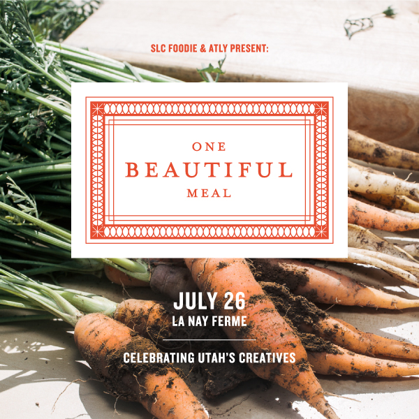
A simple, elegant design has impact of its own. As with this flyer from Valerie Jar, text is kept to a minimum and the design elements are spaced generously. The edge-to-edge background photo and clean white-and-orange centerpiece also help give the flyer an understated sophistication.
flyer-3
Image source: https://dribbble.com/shots/1416502-One-Beautiful-Meal


Blast to the Past

The handcrafted look is big right now (whether designs really are handmade or are just created to look like it). This screen-printed flyer from The Prince Ink Co. features whimsical, hand-drawn typography, which is very appropriate for a print company that runs all its prints by hand. Using a “form equals content” approach to design like this can be very effective.
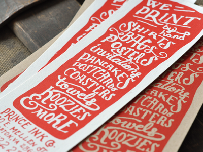
flyer-4
Image source: https://dribbble.com/shots/552528-We-print-pancakes


Study Shapes

Like patterns, shapes are a great attention-getter, especially when applied creatively. This flyer by Justin Krout uses shape in both the text and the graphics. Notice how the tilting shape of the text makes for a unique and eye-catching title, while the mountain below is made up of triangles of all shapes and sizes, creating a multifaceted, almost 3D effect.
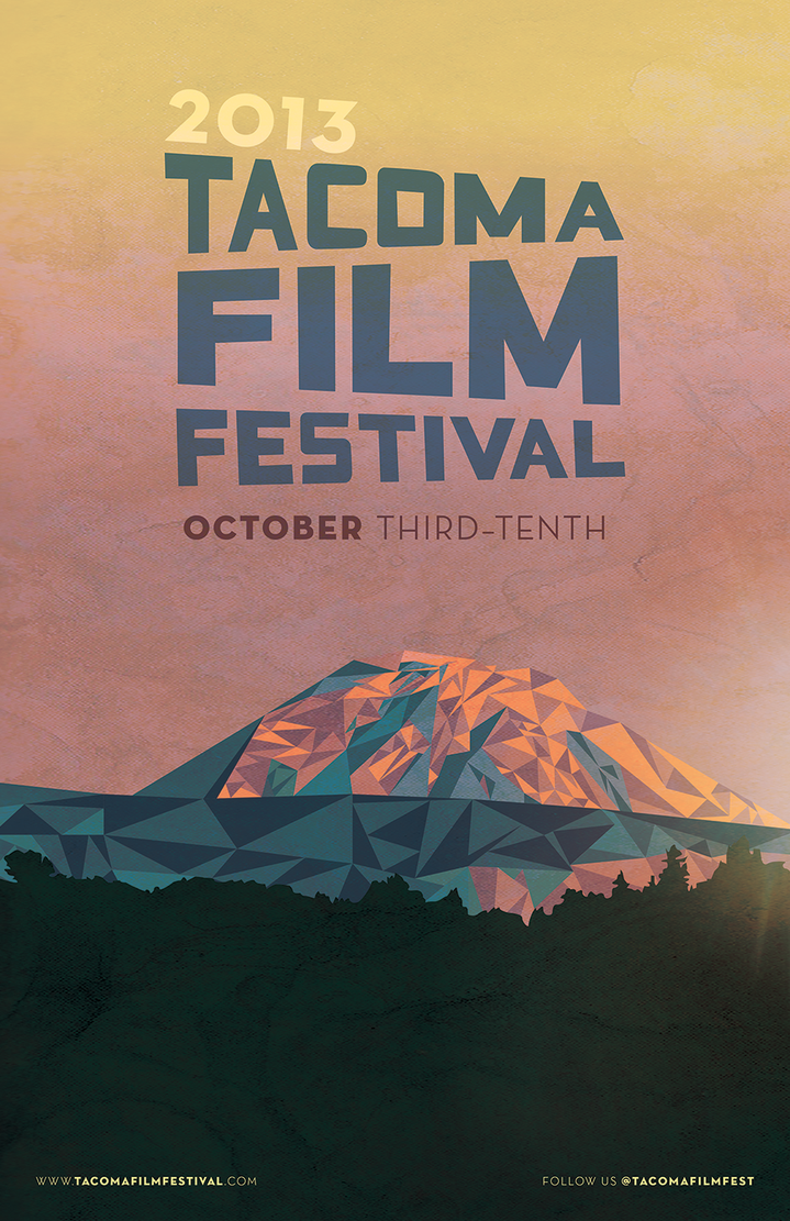

Tacoma Film Festival by jkrout555


Pick a Color Scheme

Choosing a cohesive color scheme (maybe the colors in your company’s logo) and/or staying in the same color family or temperature (warm or cool) really pulls your design together. This folding flyer by Evan Travelstead sticks to cool blues and grays against bright white for a clean, polished look.
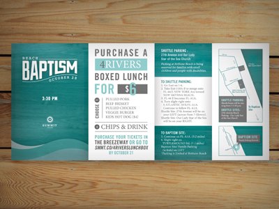

flyer-8


Rough It Up

Designs that are textured or a little rough around the edges can be a nice contrast to all those more slickly produced flyers out there. As with this hand-carved block print by Jack Daniel Bagdadi, sometimes designs (much like people) are all the more appealing and dynamic for their little imperfections.
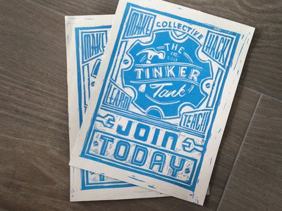

flyer-12

Find Balance

It can be tricky to make sure ornate designs are composed well and easy to read — but it can be done, and with impressive results — for instance, this hand-illustrated flyer by Joel Felix. If you’re considering a flyer design that features lots of details, good spacing, symmetry, and a plain, single-color background will help you go from busy to balanced.
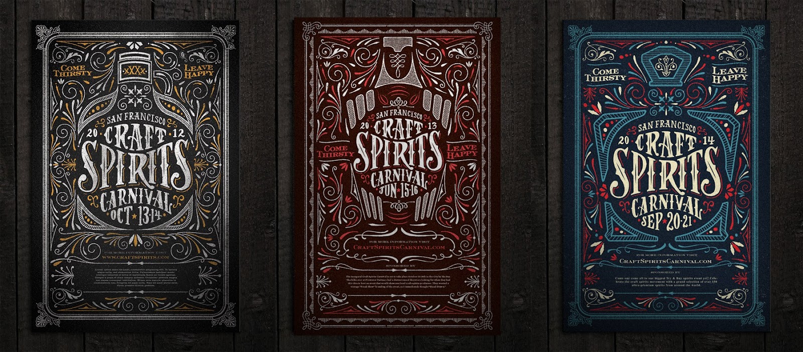

A series has begun.


Experiment With Layout

Getting creative with the layout of your design produces a more interesting visual experience and will make more people take notice of your flyer. For instance, this design by Oguzcan Pelit places the main text within the borders of an illustration, like it was scribbled there by hand.
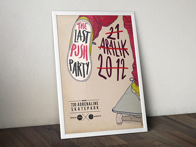

flyer-27


Be Materialistic

Flyers can be printed on just about anything. Want to get really creative? Try printing on an unusual material. It could be something easy to find like handmade or recycled paper or, if budget allows, something more substantial like this laser-cut wood flyer by Robert Hellmundt.


flyer-35


Line Up

Lines can be used in all sorts of useful ways in a design — to frame, emphasize, separate, etc. This flyer by Will Tullos features outlines and line patterns that form a whole illustration.
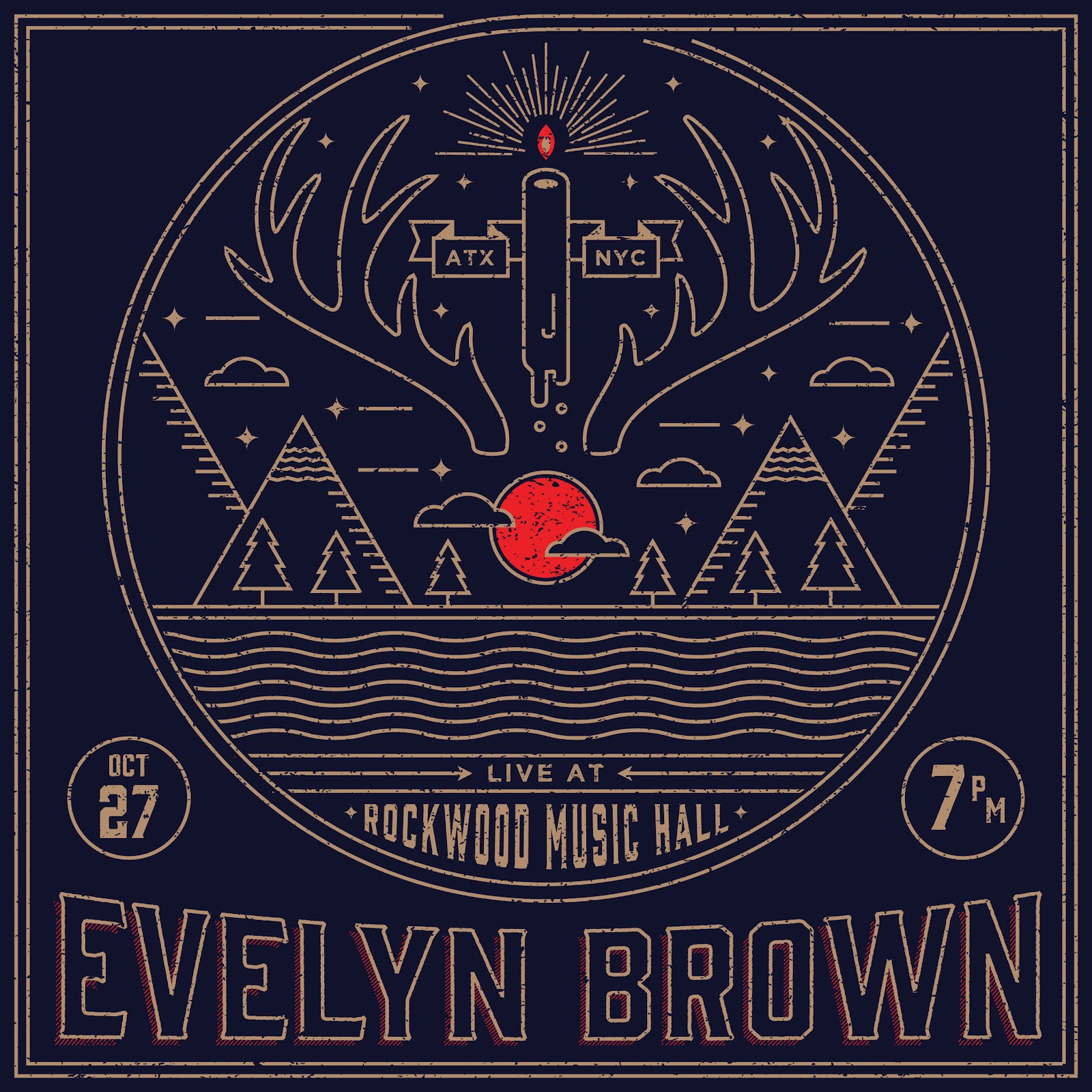

Evelyn instagram 01
Image source: https://dribbble.com/shots/1782254-Evelyn-Brown-Flyer


Frame It

Frame the part of your design that you want to stand out. A frame can be a simple rectangle or circle or more elaborate, like the concentric circles and sunrays that surround the title of this flyer by Henry Hu.
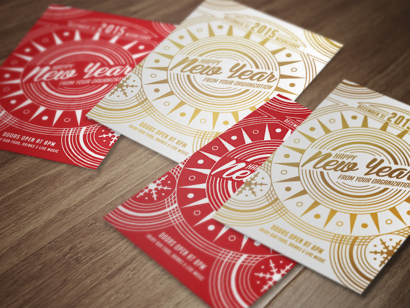

Happy New Year


Are you in South Africa and looking for a reputable place that does flyer printing? Visit the Asset Print website today.

Thursday, 28 April 2016

20 Minimalistic Business Card Designs for Your Inspiration

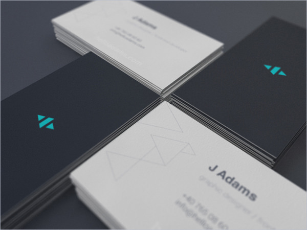
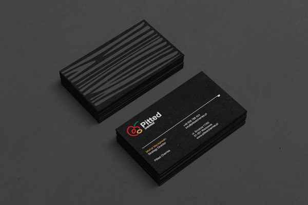
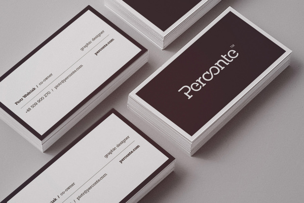
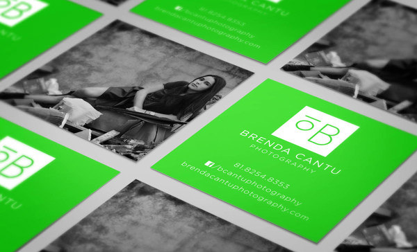
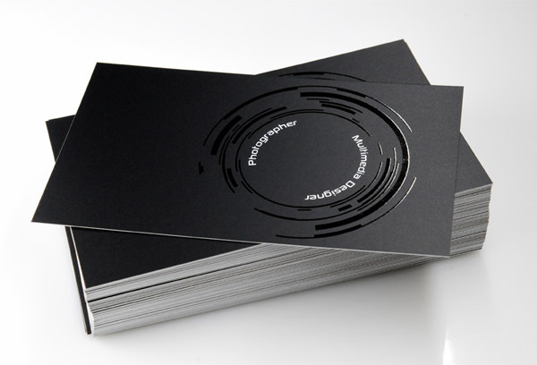
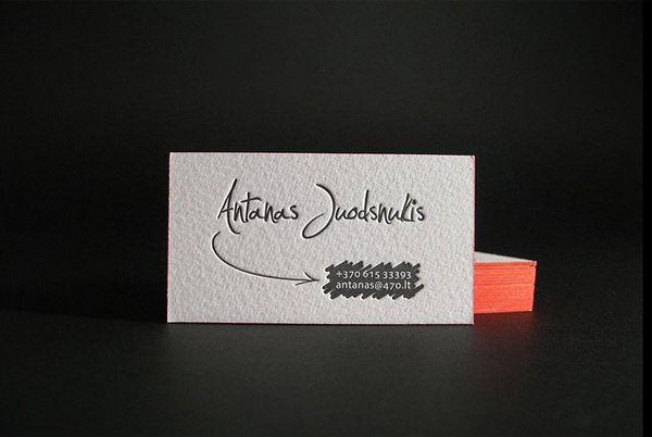
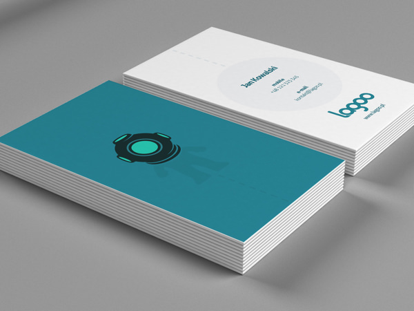
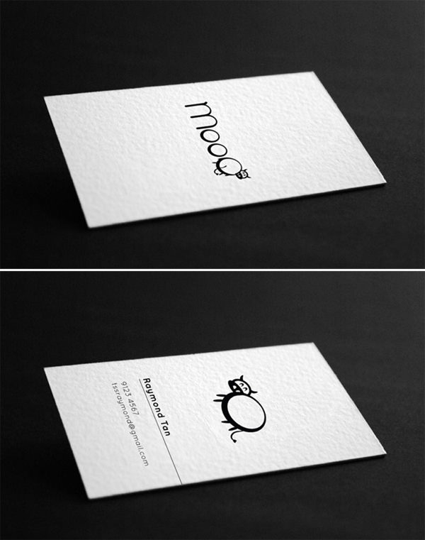
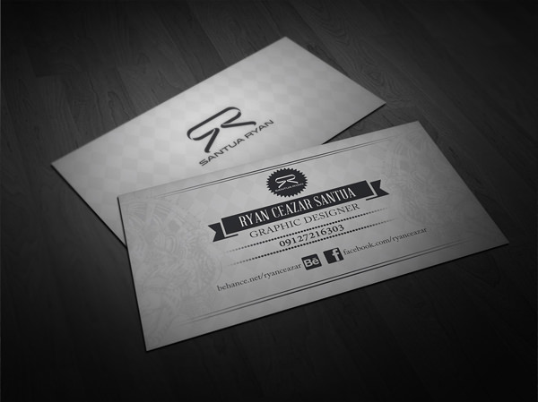
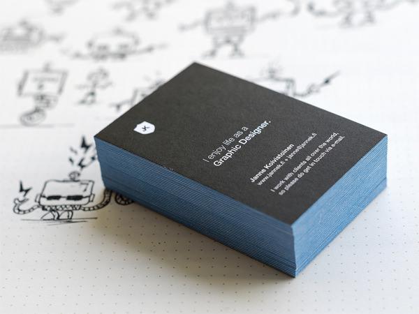
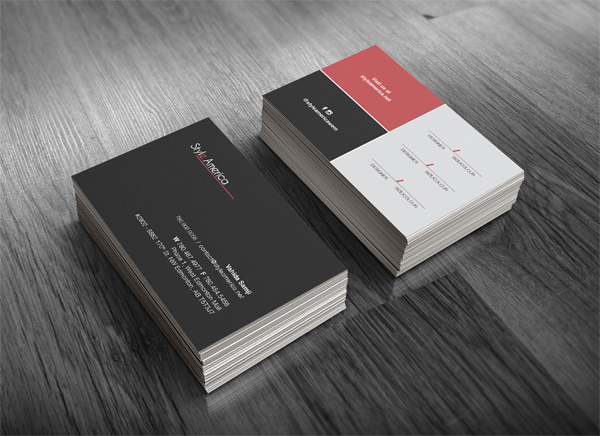
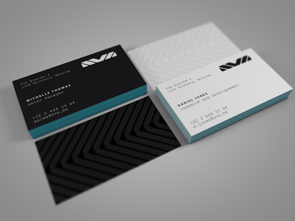
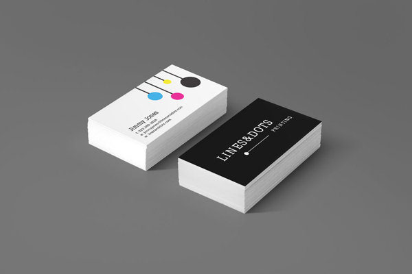
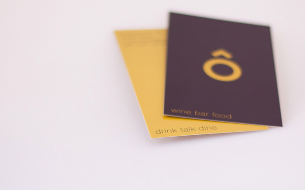
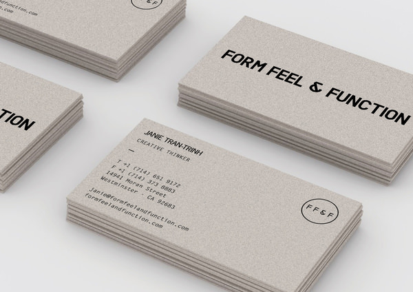
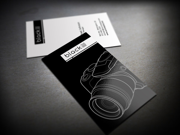
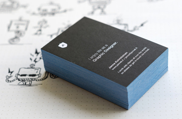
Having beautiful eye-catching business cards is an integral part of branding. With so many types of business card designs and templates available out there, it’s getting kind of hard to make your card stand out. Some creatives prefer the minimalistic approach, which is what we are featuring here today.
minimalist-card-design
The business cards you see below are minimal in color palette and design elements, but can still pull off an elegant and luxurious end. No matter if you are a doctor or a photographer, the minimalistic style fits any kind of business, good for keeping everything concise and right to the point. As Shakespeare said in his well-known playHamlet – “Brevity is the soul of wit”.
Just scroll down and enjoy the showcase!
1-simple-minimalistic-business-card-designs
2-simple-minimalistic-business-card-designs
3-simple-minimalistic-business-card-designs
4-simple-minimalistic-business-card-designs
5-simple-minimalistic-business-card-designs
6-simple-minimalistic-business-card-designs
7-simple-minimalistic-business-card-designs
8-simple-minimalistic-business-card-designs
9-simple-minimalistic-business-card-designs
10-simple-minimalistic-business-card-designs
11-simple-minimalistic-business-card-designs
12-simple-minimalistic-business-card-designs
13-simple-minimalistic-business-card-designs
14-simple-minimalistic-business-card-designs
15-simple-minimalistic-business-card-designs
16-simple-minimalistic-business-card-designs
17-simple-minimalistic-business-card-designs
18-simple-minimalistic-business-card-designs
19-simple-minimalistic-business-card-designs
20-simple-minimalistic-business-card-designs
Looking for a reputable printer in Cape Town to print your business cards? Contact Asset Print today!

Tuesday, 26 January 2016

5 Extremely Creative Business Card Designs.

When we found this wonderful article full of great business cards we just had to share it with you! We have chosen our five favourite designs. Read on and enjoy!

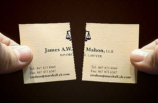
1. Tearable Divorce Lawyer Business Card

creative-business-cards-64

Notice that the card has contact information on both sides.

2. Yoga Mat Business Card


A simple, yet very creative business card for Vancouver yoga center. The card rolls just like a yoga mat.

3. Fitness Trainer’s Tearable Business Card

creative-business-cards-56

Zohra Mouhetta helps you strip away your belly! (Advertising Agency: Leo Burnett, Dubai, United Arab Emirates)

4. Dentist’s Cavity Business Card


5. Classic Rock Theme Business Card


This groovy hair salon comb plays a classic rock theme when rubbed by fingernail, using the same principle as a musicbox comb. (Advertising Agency: Fabio Milito design, Roma, Italy)

If you want your own selection of unique business cards, and you are located in Cape Town and surrounds, have a chat with Asset Print!


Friday, 18 September 2015

Business Card Marketing: Guerilla Marketing Tactics

When it comes to marketing, the humble business card can be a highly effective marketing tool, especially if you start to think about guerilla marketing tactics. Not only are these tactics really great for drumming up business, but business cards are also surprising cost effective so you don't mind experimenting with different tactics to find the perfect ones for you needs.


But before I show you a few tricks to make the most of your business cards, we need to understand the idea behind guerilla marketing. In a word that is driving by advertising on almost everything, sometimes the best way to catch the attention of prospective customers or clients is to do something unorthodox and catch them off guard. If done it the right way and you choose your tactics right, their surprise will turn into interest and then into business.

The first step that you will need to do is to get some good business cards. I usually get mine from Asset Print as I’ve known them for years and  they usually give me a great deal. While getting eye-catching and well designed business cards are essential, don’t forget that most of your impact is going to come from how you use them. Obviously not all of these tricks will work for your business, you are going to have to be think about your target market and think like they do to find the best spots to snag them.

Effective guerilla business card marketing include:

  1. Insert them in right magazines in waiting rooms at the doctor’s, other businesses even the right hairdressers.
  2. Next time you are at a business event, leave them on empty seats.
  3. Stick a few in the mirror at trendy restaurants and bars. This works great if your business cards are magnetic.
  4. Stick them in industry related books at the library.
  5. Bulletin boards at the local store, blocks of flats, restaurant. All of them are potentials!
  6. Slip one or two into all your outgoing mail even if it is just a bill repayment.
  7. Slip them into a few stationary store stands near the pens.
  8. Speak to local business and restuarants and see if you can leave a stand with cards on their counters.
  9. Leave a few in the gym changing rooms.
  10. Write a short note on the back such ‘great guy - must call asap’ or similar and drop somewhere.

Be realistic with your tactics:while business cards may be cheap, a little planning and careful thought will allow you to make the most out of them. And if you are going past Asset Print mention this article. Who knows, I might get even better prices from them!

PS: For more information on business card printing click here.

Written and Contributed by Kevin Myer

Orignally posted on: https://printingcapetown.wordpress.com/2015/09/18/business-card-marketing/