Monday, 8 May 2017

Custom Stickers: Nonprofit Fundraising Ideas that Stick

Are you looking for ‘profitable’ nonprofit fundraising ideas? This article outlines five innovative ways to put this low-cost investment to work in generating non-profit funds.


If there’s one thing nonprofit organizations are almost always in need of, it’s reliable sources of income rolling in through memberships, grants, events and donations. But part of the challenge involved with the yearly fundraising cycle lies not just in making your appeal, but in keeping it fresh and making it fun. One of the ideas that offers the most fundraising bang for your nonprofit buck is using custom stickers.


Custom stickers can be made to order with your name and logo and can include special slogans and catchphrases that help to build awareness of your charity in the community while raising much-needed funds. Here are a few ideas to get you started.

1. Sell them
Custom stickers are an extremely inexpensive investment as far as fundraising products go, offering as much as 300% mark-up. Sell your organization’s custom stickers at fundraising events, at booths in fairs and festivals where you might be exhibiting, and anywhere your supporters, current or potential, might be gathered.


 2. Use them as a membership incentive
Have a spring membership drive? Use the ease of sticker printing as part of your thank-you for new members. Your supporters will appreciate the thoughtful gesture—while at the same time providing an opportunity for them to further advertise their support of your organization. Consider a design your supporters will be proud to show off: “I brake for the arts” for a kids’ art program, for example, or “Fish Lover” for a conservation organization benefiting a river. Change the concept each year to keep it fresh and encourage annual renewals.

3. Honor your major donors
Have a multi-tiered donation platform with memorable or intriguing names? Honor your donors with a custom sticker designed in conjunction with a local artist as part of your overall thank-you package.


4. Send them to foundation staff
Has your organization received grants for programs or services in the last year?  Consider adding the personal touch to your final reports and grant updates by including a few of your organization’s custom stickers, with a handwritten thank-you note for those foundation staff who have assisted in ministering your grant.

5. Use them as incentives for filling out surveys
If your organization presents events or workshops, getting audience-members, supporters and/or participants to fill out surveys is one of the best ways to collect the kind of data that makes for strong foundation grants. Offering a free sticker as an incentive is an easy way to encourage this.


With a good working knowledge of nonprofit fundraising basics, custom stickers can be an important, low-cost tool in both raising funds and promoting the visibility of your cause in the community.

Article source: http://customstickermakers.com/blog/custom-stickers-nonprofit-fundraising-ideas-stick/

Monday, 3 April 2017

Why Custom Invoice Book Printing Is Essential

Many small business owners use generic invoice books that make and keep track of orders, but it can prove incredibly beneficial to take advantage of professional custom invoice book printing.
Not only do these custom invoices help pull in more customers, but many companies report that the custom printing of unique designs improves customer loyalty and retention.
Here are just a few of the major benefits of having your own personalised invoices.
Build your Brand
Part of building a brand is having custom imagery, unique colours and slogans to differentiate your company from the competition. There are many ways of building your brand and social recognition, but this will just focus on custom invoices.
Invoice forms aren't just used for orders. They are similar to business cards because they display your logo, and tell customers who you are and how to contact you.
Invoices are also commonly used as a quoting mechanism because you might be asked to make an itemised statement of charges for a formal quote.
Having a custom invoice will separate you from the rest of your competition. There are many examples of clients choosing companies solely based on their image and branding. Don't miss this opportunity to gain some new clients.
Unique Fields
While there are some companies that can use generic invoices without running into any issues, the truth is that most businesses can't do this. They often require information that other companies don't ask for.
If you are having this problem, then there are two things that you can do. The first is manually writing the field onto a generic invoice. This looks sloppy and reduces the client's confidence in your business.
The ideal route is to invest in professional invoice book printing because you can customise the form to your exact needs.
Improve Customer Loyalty and Return Purchases
As stated above, custom invoices help build your brand. Many companies have found that clients are more willing to come back for return purchases if they use custom invoices. There are several reasons for this. The most important one is that these invoices are much easier to remember. If you use printing and marketing that is easy to remember, then customers will more frequently choose you over your competition.
The other reason is because it shows that you are willing to put more work into your presentation. Clients tend to believe that this is a mark of quality, which can influence them to make more purchases from you.
Quality Paper
While there are some exceptions, you will find that most generic invoice books use rather poor paper. The invoices often feel scratchy and unpleasant. This might not seem important, but it conveys a message to your clients. Many clients will assume that you don't care about your work as much as another company that has better invoices.
Custom invoice printing uses quality paper that is smooth and durable. You will see your customers' eyes suddenly light up when they feel your invoice. This is because most companies don't pay attention to the quality of their invoices. A good invoice can leave a powerful impression on your clients that can translate into additional sales.
Conclusion
Taking advantage of invoice book printing is essential if you want to run a successful company. While you can make sales with generic invoices, they definitely have their weaknesses. Uniquely designed invoices feel and look better, help build your brand and they can lead to additional sales. If you want to make the most of your company and create the right impression with your client base, then use custom invoices.
Asset Print is a leading online print and design company that offers many unique items such as invoice book printing. They offer affordable printing options to busy companies that need the highest quality printing.
Article source: http://ezinearticles.com/?Why-Custom-Invoice-Book-Printing-Is-Essential&id=7553690

Monday, 23 January 2017

Create perfect printed stickers

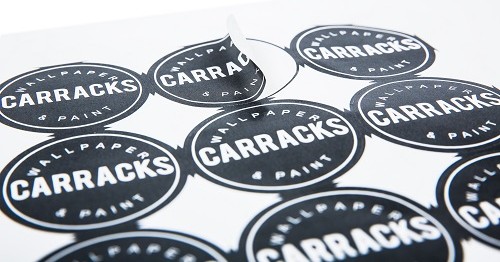
Everyone loves stickers! And these little marketing tools are really effective if used well. You can use your stickers on packaging, as free gifts, on products or for a sticker advertising campaign. These days, many companies know the power of advertising with printed stickers. There’s plenty of competition, so it’s important to design your sticker so that it looks great and sticks out from the crowd.
Printed Stickers | Digital Printing UK
There are endless possibilities for your printed colour stickers.
With this in mind, we’ve put together five great tips for creating perfect printed stickers that are sure to get you noticed.
Choose great colours
Choosing the right colours will obviously help your stickers to stand out. Good, contrasting colours will help your message get noticed and a great advantage of digital over process printing is that you can choose any colours you like at no extra cost. There won’t be registration issue either, so your stickers will appear sharp and striking.
Pick a striking image
If you’re using an image, make sure it’s likely to grab attention. Your image resolution must be at least 300 dpi at its final printed size to avoid it looking blurry.
Keep it simple
Just because digital printing process gives you so much choice doesn’t mean you have to go wild with graphics and content. With sticker advertising, simple is always best. Too much visual information on your sticker will see it overlooked. Make your message clear and easy to see at a glance.
Consider location
Where are your stickers going? If you’re placing it on packaging, make sure it stands out well from the paper colour. If your sticker is part of an advertising campaign and might go in a number of different locations, choose colours that will stand out anywhere.
Tease your audience
Stickers are best used to entice people to find out more. Some of our customers simply print a QR code or web address on a coloured background. This is a great way to drive traffic to your online pages and people are always intrigued by teaser messages.
Visit a reputable digital printing company such as Asset Print  for Printing, Rondebosch, Cape Town to get started.


Tuesday, 22 November 2016

Why Business Cards Still Matter (and How to Effectively Use Yours)

Patrick Allan


With most business being done digitally, you might think that business cards don't matter anymore. But they can offer a lot. Here's why they're still important for business and how you can get the most out of yours.

Why Business Cards Still Matter

Business cards still matter because our memory sucks. How many times have you met someone, spent most of the conversation thinking of what to say so you don't sound stupid, then promptly forget their name when it's all over? Mitchell Friedman, Associate Dean of Student Affairs and Career Development at Presidio Graduate School, explains:

...when you meet a person at a business event, get their business card. Perhaps even write a note or two on the reverse side of the card to capture the key points of your conversation while they're still fresh in your mind. The bottom line here is to have a physical record of contacts you make so you can follow up as appropriate in conjunction with your broader job search/career development efforts.

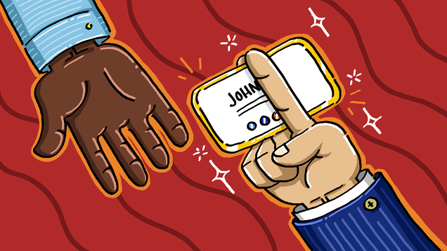
A business card is a road map to opportunity. It could lead you to a great new job, a great business partnership, or simply help your business make money. Think of a situation where you you've got your networking pants on and you're looking to benefit your business by making contacts. Suddenly, you notice someone that could be a potential client. What do you do? You introduce yourself and describe what you do, but at some point, you'll need to hand off your contact information. A business card saves you time and makes you look professional. You're not fumbling around with a pen to scribble your e-mail address on a cocktail napkin, and you also give them a sense that this isn't your first rodeo.

Not only is your first impression important, but business cards provide tangible information for others.  Writer Sarah Brooks at Successful Blog explains that it gives them something physical to refer to later should they decide they want your product or service:

Business cards put a face to a business – When meeting someone new, handing them your business card (preferably with your photo on it) will help keep your business in the back of their minds. Though they may not need your product or services today, there may come a time when they do, and hopefully they will be able to pull out your business card and call versus trying to remember your company name and searching the web.

Your business card is a physical object that potential clients can take with them that keeps you or your brand from just being a name that floats around in the ether. It's great if you have a web site, but commercial printer Shaun Caldwell explains on his LinkedIn blog that cards have certain perks:

Business cards never have downtime.They're always accessible, and never have dead zones or Internet outages. Your business card can be viewed no matter where you are located, and even times when cell phones and other devices must be turned off, such as on an airplane ride or in a hospital. Your business card is always working for you.

Not everyone thinks business cards are essential, and some argue business cards have lost their edge. Ilya Pozin, writer for Forbes and Inc., describes a shift he's seen on his LinkedIn Blog:

As for me, I haven't had business cards for many years either. Instead, I make a point to ask my new connection to email me. (When I respond, I include my full contact information.) It's become normal to see people at networking events in L.A. using their phones to collect contact information right there on the spot. Fast-forward a few years, and it won't be surprising to find Google Glass-wearing techies exchanging contact information by looking at each other.

Technology, and—more specifically—smartphones have made information sharing easier. These days you can email someone while you're meeting them with a few quick taps of your thumb. There are even apps out there that can share contact information with someone with barely any effort at all. So why bother with a card when you have all of this other stuff?  Networking is about making meaningful connections, and sometimes technology—or the act of using it—can be impersonal.
Eight Power Networking Tips to Make More Meaningful Connections:

Meeting someone in person only to look down at your phone and start tapping can seem rude and disconnected. You want to smile, make eye contact, and make the conversation you're having be your main focus. You don't want to be hoping they have the same information sharing app, asking for their email immediately to send your info, or looking down at your screen. Technology can still be used to enhance your experience, however. Apps like Evernote can scan the business cards you collect and make storage and organization easier. But business cards already use one of the best information sharing apps out there: your hands. Until we actually can look someone in the eye to share information, you're better off keeping conversations personal and connected.
Business cards are cheap, portable, and easy to give away, so there's no reason not to have one. Even with email, LinkedIn, Facebook, Google+, and Twitter, people expect you to have a business card. It shows professionalism and it demonstrates that you care. In a sense, business cards are a way for you to say, "I belong here, I know what I'm doing, and you should consider me a factor." They are a paper handshake that instantly gives whoever you meet everything they need to know in order to do business with you.

What Should Be on Your Card and How to Make It Stand Out

What goes on your business card largely depends on what kind of business you're in—or want to be in—and whether or not you have the ability to make your own. If you work for a large company your card might be predetermined, but that doesn't mean you can't use something of your own design. Either way, there are a few essentials you should include.
Be deliberate about the information you include and keep clutter to a minimum.
You don't want the most important bits of information getting lost in a mess of words and numbers. You need your name—or name you go by—and job title on the card, along with the name of your company or what you do. List your business phone number, work email, web site, and possibly the location of your business if that's important to know.

Put your information on the front and leave the back blank.
If you're adventurous you can experiment with different styles or maybe a logo on the back, but for a solid card style you can rely on keeping things basic.  Writer John Williams at Entrepreneur recommends keeping the back of your card blank:

How often will people see the back of your business card? Traditional card storage modes assume that side is blank. If you do wish to put copy on it, be sure the information is of a supplemental nature: e.g., your company's mission or tagline. While business cards should promote your brand identity, they shouldn't be confused with advertising.

Use white as the base color of your card.
That way, people who have received your card can write visible notes or additional info on the front and back.

Stick to the standard size of 2" by 3.5".
It may seem like an easy way to make your card stand out from the crowd, but more than likely you'll get your card tossed because it won't fit in someone's wallet or other business card holder. Remember, the idea of the business card is give them reference information after you've wow'd them or pique their curiosity so that you can wow them later on. You don't necessarily need to wow them with bizarre card shapes or confusing designs.

Use your photo and add value to your card.
Susan Adams at Forbes spoke with online marketing consultant Don Crowther, and he suggests putting your gorgeous mug on your card:

Why include a picture? "You go to a convention, and you come home with 55 cards in your pocket," Crowther says. If one or two cards have photos, you'll remember those people.

Crowther also suggests that including some sort of incentive on your card will increase the likelihood of others getting in touch with you. You can offer discounts, special services, or even advice if that fits your business. You want people to remember you and feel like getting in touch with you will benefit them.

On the U.S. Small Business Administration blog, writer and CEO of GrowBiz Media Rieva Lesonsky shares some other tips on standing out worth considering:

  • Incorporate QR codes: The jury is still out on this, but for some professions—like tech related careers—QR codes can be a great way to direct people to a web page filled with important information that could never make it on a card. It also, however, takes up a great deal of space, so don't let it become clutter.
  • Spend more on quality: You can buy basic business cards for very cheap, but you may want to consider the message you're sending with cheap paper and print jobs. Think of how a nice magazine feels in your hands compared to a floppy tabloid. Regardless of what's inside, the magazine feels better and seems more professional.
  • Choose the right font: Keep your fonts 12 points or larger and make sure they are legible! It's okay to play around a little here, but if you're even a little bit concerned if others will be able to read your card, pick something else.
  • Consider professional help: One way to ensure you get what you need is by hiring someone whose job is to design. Graphic designers know their craft and they can come up with something clever, informing, and professional.
All in all, there are three keys to a perfect business card: it contains all vital information needed to contact you, it entices people to learn more about you or get in touch, and it stands out without being too different.
The Best Business Card Practices

With the right card, you're ready to network your butt off. Here are some strategies that can make sure the handing off of your card doesn't go to waste. After all, you don't want to go through the trouble of making—or buying—the perfect design if they're not going to get good use.

  • Be prepared: Always have business cards on you. Always. Even when you're on vacation you might make a connection with someone. Keep a few in your wallet and you'll be good to go.
  • Be selective: You may have a thousand cards, but that doesn't mean you need to use them all at one conference. Tossing your card at every single person you meet will get them tossed in the trash and waste your cards. A good rule of thumb is if you shook their hand after making a connection, hand off your card.
  • Be interested: If you hand off a business card, try to get one back. Most of the time they'll try to reciprocate when you give them a card, but if they don't, ask. Showing your interest in them can increase their interest in you, and it never hurts to have their information for reference.
  • Be proactive: When you do get their business card, take some time to look them up on LinkedIn, Twitter, or wherever else they may have listed themselves. Doing this will help you remember the names of the people you meet and often let you put a face to the name. Now when they shoot you an email, you're not trying to decide if it's the guy you sat next to or the guy you talked to outside of the bathroom.

Keep these business card basics in practice and you'll come across as professional while potentially saving yourself a headache down the road.

It is also important to have a reputable business card printer at hand. Asset Print in Cape Town in an example of such. Visit the Asset Print website and contact them today.


Tuesday, 25 October 2016

The Benefits and Uses of Banners for Business and Events


Before the advent of digital printing on vinyl, custom banners were limited to clip art style graphics and blocky letters, but these days vinyl banners look incredible. From advertising a business, to announcing a city wide event, the uses of vinyl banners are only limited by your creativity. Whether you’re considering vinyl banners for your business, or looking for an inexpensive way to say “Happy Birthday” vinyl banners are a solution you should consider. Here’s a few of the pros of vinyl banners.

Digital Printing

Before digital printing was widely available, the only method for making a vinyl sign was by heat pressing other pieces of vinyl directly onto the banner. This not only affected the durability but also the appearance. Words had to be blocky and any graphics included were simplistic in nature (think clip art).

Now that digital printing has been adapted for use with vinyl banner printing, the ability to produce a high quality, professional looking banner is not only effortless, but also inexpensive. One benefit to digital printing is accurate color representation as well as the use of photograph quality images with thousands, or millions of colors.

Durability

One of the biggest benefits of vinyl banners , especially if printed by a good printing company such as Asset Print, over cloth or paper is the durability. Vinyl banners are tear resistant and weatherproof. These banners are also able to be used in windy areas by punching small holes to reduce the surface area that resists a blowing wind.

On top of the durability the vinyl and ink used for digital printing can be UV resistant which allows these banners to be placed in direct sunlight for long periods of time without any deterioration or fading of colors. In short, UV resistant inks keep things looking bright far longer!

Uses of Vinyl Banners

The best aspect of vinyl banners is the fact that they are so versatile. In fact, you’re pretty much able to use them for anything. Due to the fact that these banners are weatherproof and durable they’re perfect for outdoor advertising. Businesses can use them to advertise special sales, open houses, or other special events like conferences. Cities may use them to promote city wide events, parades, fairs, districts, or anything else the public needs to know about. Individuals may use them for birthday banners or for anniversaries and family reunions.

Since they’re so durable they can last for years if properly stored and cared for. This means you can use the same “Happy Birthday” banner year after year, which is perfect for people in various industries like catering. Whether you’re a business or an individual, custom vinyl banners provide a solution to all your advertising needs.

Writer: Annie Harrington.
Image Credit: Banner Image courtesy of MorgueFile

Tuesday, 19 July 2016

Striking Examples For Designing With Black and White

But, despite this, for lots of designers, stripping your design’s palette back to just black and white might not seem like a viable option, or it might not even have crossed your mind. Black and white can seem like a very inflexible palette, but believe me when I say, it’s actually quite the opposite. In fact, black and white is incredible versatile, easy to use, and effective as anything!

Whether you are designing posters, flyers or book covers. It is utterly important to create something striking, yet not overwhelming.

In this list we’ll look at stunning monochromatic designs and hopefully you’ll quickly begin to notice how flexible this small palette really is, and just how easy it is for you to kickstart your own black and white designs. So, let’s get started.

Generate Movement With Bold Lines


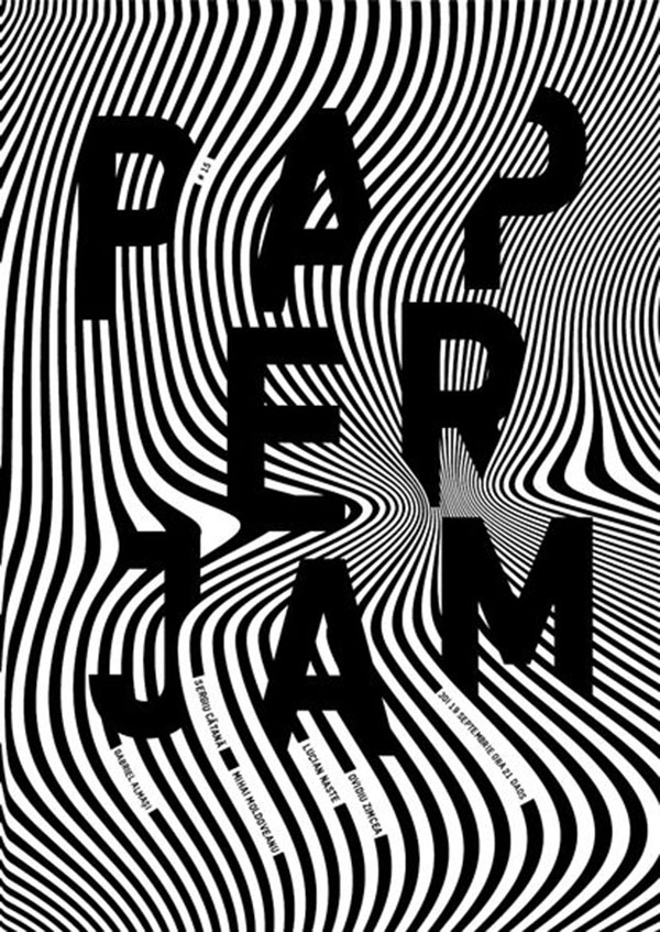
Describing a stationary object as having a lot of ‘movement’ can sound a little odd, but check out this design from Paperjam and note how it uses warped bold lines to create a sense of movement and depth. By overlapping the type with the graphic lines, this piece creates the illusion of the type being sucked into the design, giving the piece as a whole a very immersive effect.

Create Elegant Illustration-Based Patterns


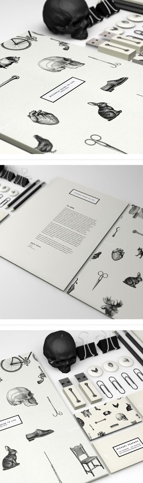
We tend to think of patterns as colorful, geometric things, but check out this monochromatic design by Pharaoh that instead uses elegant and detailed illustrations to form a branded pattern. The combination of mysterious, beautifully drawn elements and the sharp black and white palette make this branding kit effective and striking.

Divide Your Design With Sharp Lines


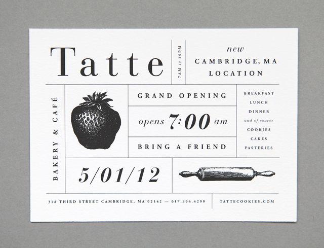
Got a lot of information to include on one page? Consider breaking that info up into separate blocks by using sharp, fine lines, just as this example by Amanda Jane Jones does. This piece divides the elegant monochromatic type and imagery into a modular grid which creates a strong structure and very neat composition.

Channel Film Noir


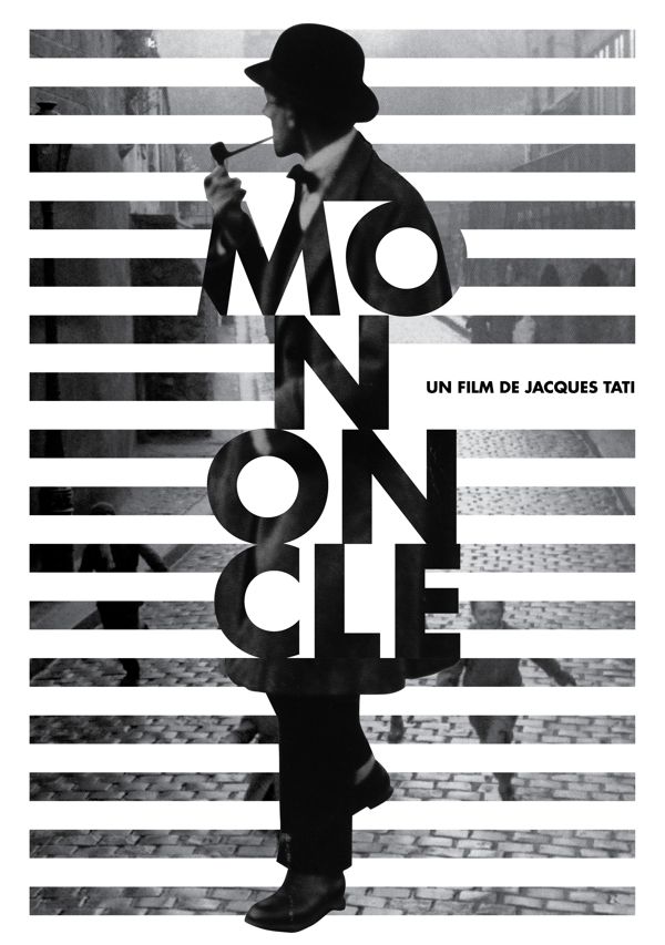
If you’re looking for a way to add a lot of cinematic drama to your design, check out this movie poster by Kate Marie Koyama Design. By pairing monochromatic photographs, bold, stacked sans serif type, and pronounced stripe cut outs, this design channels the dark tones and venetian blind shadows of film noir to create a mysterious, engrossing design.

Use Lines To Create Stunning Patterns


Lines are incredibly versatile graphic elements, and when paired with a stark black and white palette, there’s no stopping them from being really striking. This design by Demian Conrad makes the most of this device by using a mix of straight and curvy lines to frame and draw attention toward the title type.

Quick note: If you’re using busy monochromatic lines like this example, be sure to balance it out with blocks of white or black (again, as this example does) to prevent the design from becoming overwhelming.

Compare and Contrast


The beauty of black and white color schemes is that you can take your design and simply invert the colors and you have a whole new (still functional and effective) design in your hands. This invitation design by Robot Food does just that by having half the invitation as white on black and the other half inverted as black on white, creating a bold contrast between the two designs.

Detailed Illustrations vs. Sharp Graphics


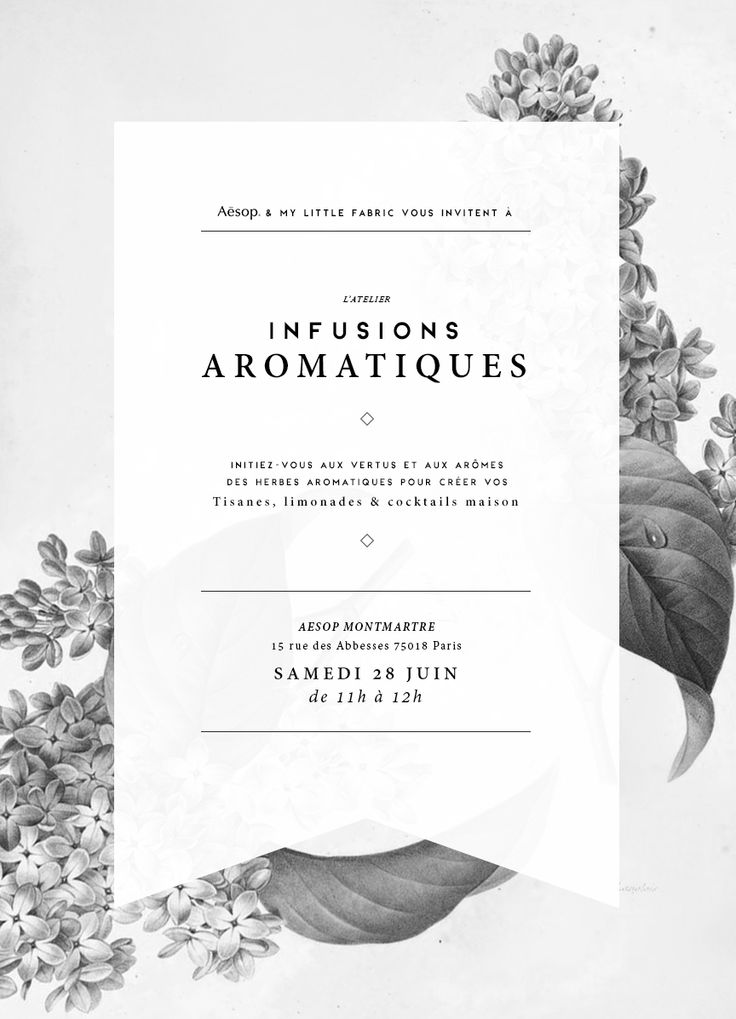
This design by My Little Fabric pairs an elegant and detailed illustration with a crisp white transparent frame and elegant type to create a super simple, classic design. The contrast of the sharp graphic against the traditional serifs and illustrations keeps this design fresh and modern, while still retaining that vintage-inspired charm

Don’t Forget the White (or Black) Space


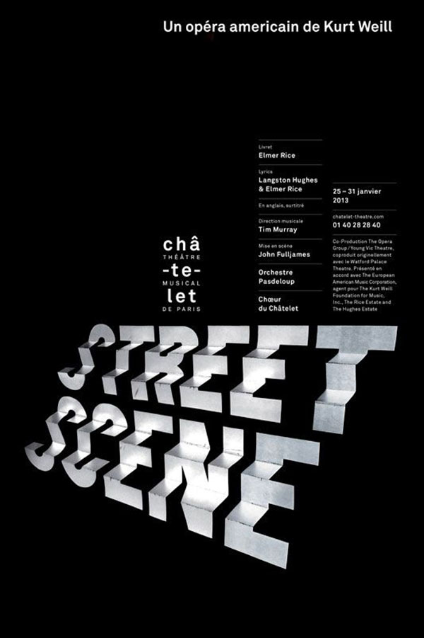
White space is a magical tool in the world of design, but it’s important to remember that it doesn’t always have to be white. In the case of this design by Philippe Apeloig, the white space is black, but it acts just like any other piece white space out there would – it frames, declutters, simplifies and lets the design ‘breathe’, putting the focus back on the important elements, like that clever dimensional typographical title.

Use Monochromatic Textures


Textures are one of the most ubiquitous design elements around, and you can easily (and effectively) adjust them to fit within your new monochromatic palette. This design by Axel Lokrantz Månson uses a monochromatic marbling texture to add a simple, unique effect to what is otherwise an extremely simple design.

Make It Dramatic


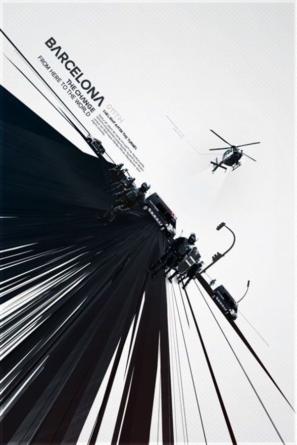
This design by Metric72 brings a whole lot of drama to the table. This poster manages to pack a real punch by using a perfect combo of a striking black and white palette, a powerfully constructed image, bold leading lines, and an atypical diagonal alignment in place of the typical horizontal/vertical alignment.

Over to You – Get Started With Your Own Black and White Palettes!

A black and white palette is a classic for a reason, you can work it to become just about anything you want it to be – classic, sharp, modern, or traditional. All it takes is the right application, the right intent, and you’re ready to go.
So, next time you’re sitting down and getting ready to design a poster, invitation, or brand kit, just take time to consider cutting your color palette right down to just black and white. It might be a bit of a challenge at first, but trust that the end result can really pack a punch.

Article source: https://designschool.canva.com/blog/black-and-white/?utm_source=FloatingBar&utm_medium=twitter&utm_campaign=DesignSchool

Note from us:
When talking about posters, business cards, flyers, and so forth you have to remember that a reputable printing company is required to make your amazing design a reality.

We recommend Asset Print, if you are in Cape Town and surrounds. Visit the Asset Print website today at www.assetprint.co.za.

Source: http://printperfection.postach.io/post/striking-examples-for-designing-with-black-and-white