Top 6 Business Card Trends In 2018

Business cards have contact details of a company. But today that is not the sole purpose of them. Matter of the fact is that marketers have turned the cards into an effective tool to convey the brand message of a company. However, a business card design becomes part of a brand building exercise only when the card is unique and memorable.
Make sure that your clients keep your business card with them. If your design is unique and attractive, they are most likely to remember it. They will keep the card in their drawers at home or office. Remember that 80% of business cards handed out to the people are thrown away within a week. That shows the importance of creating a business card design that looks professional, appealing and aesthetic.
The main purpose of business cards is to deliver contact details of a company. Another purpose is to impress the clients. In fact, making an impression on the recipients is the most important reason behind creating varieties of business cards designs. So, while receiving the contact details, the client must get a good feeling about the company. This brings us to the importance of business card design.
Business owners have to compete hard in their niche markets. They want to explore all the opportunities to draw consumers’ attention toward their companies products or services. For them, a business card is the way to share their vision of the company.
The trick is to create the card design that surpasses the customers expectations. The cards must quickly draw their attention toward your business, and what it stands for in terms of values.
A business card has the company logo and colors. These two elements express a brand message to the audience. Graphic designers have to experiment in order to create unique designs, which can stand above the crowd. Each year, we see numerous new designs of business cards. Many of them fade away quickly, while some stay in our minds for a longer period.
In 2018, we have already seen some of the business card designs making firm inroads. If you are a graphic designer, then follow these trends in your own way to create impressive new cards for your clients. As a business owner too, you must be aware of these new developments in creating the designs.
Here Are Top 6 Business Card Trends In 2018
01. Simplicity Of Design
Business cards are primarily meant for informing the recipient about the company’s business and its contact details. Every business card has an email address of the company, its phone number, website address, fax number etc. as contact details. A graphic designer should aim at delivering the details in a simple way.
The recipients should get the contact details at a glance. A simple graphic design means the potential consumers eye can focus on the details immediately without diverting to any other fancy elements. So, the new trend is to avoid fancy designs and keep the card minimalist, without losing its sophistication.

[Source: View Case Study On Designhill]
However, simplicity does not mean that the card lacks in style and a decent setting. These two design elements are necessary but they should not overshadow the contact details and company logo design.
02. Put Your Branding Elements
A business card design should have a simple look that can display your contact details quickly for the recipients. But make sure that your potential consumers get your brand message too. Your brand message lies in its color schemes, images, and symbols, if any, that you use in your logos and other marketing material.
So, spread your colors and logo in your business card in a sophisticated way. This trend in 2018 has been a hot favorite of the designers. They are keeping the colors, symbols or images of the companies in the background.

[Source: View Case Study On Designhill]
It is usually preferred that the card uses colors taken from your logo and website design. There is also a lot of white space usage in the background. This way, the contact details are clearly visible when the intention is to use the cards for branding purpose.
03. Big Typeface
Use of bigger typeface that dominates the card space is also a trend in 2018. Big typeface immediately draws the attention of the viewers to the company name and a tagline. Most of the business cards are being created in this way.
The cards have a bold typeface with a single color in the background, giving the design a unique look. But make sure that your business card and other design materials such as brochure have the same elements of colors and typeface.

[Source: View Case Study On Designhill]
And that the typeface expresses your brand’s personality. Use the typeface that you have already used in your marketing campaigns.
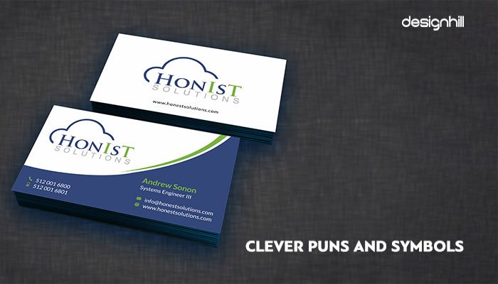
04. Clever Puns And Symbols
Another business card design trend for this year is including some witty lines in the card. The humour energises the recipient of the card and evokes excitement. Words have their own impact on the thinking process, which means that adding a witty statement about your company will make your business card design more acceptable to the consumers.

[Source: View Case Study On Designhill]
Incorporating a symbol further complements the card’s design. Pick the symbols that express your business values and brand message, at its best.
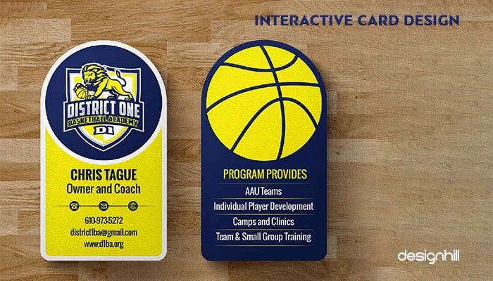
05. Interactive Card Design
Many business card designers are experimenting with the designs to make cards more interactive, meaning that the users have more in the card to explore. Most of the interactive designs have suspended small slots of information. The user can pick a sliding inner piece to drag out rest of the card that has additional information.
The designers are experimenting with many ideas for creating the interactive card designs. Some Graphic designers have created dual or triple layered cards. However, we suggest you not to overdo it, as it ruins the overall presence. Create interactive designs but know that the users will not be spending too much time toying with the card design. So, keep it simple.

However, make sure that the design elements in your interactive card design matches rest of the graphic elements of other marketing materials. For example, a leaflet is often ignored as an insignificant marketing tool. But ideally your leaflet design and business card designs should carry similar elements.
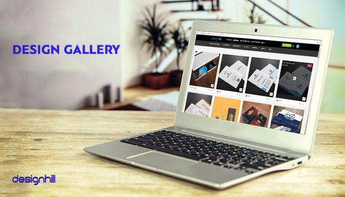
06. Design Gallery
Here are some more examples of business card designs for your inspiration. You should have a closer look at these cards and you will come to know about the new design trends making rounds in 2018. These examples will stimulate your creative brain to come out with some exciting and unique design concepts.
Simplicity of business card designs, big typeface, witty slogans and symbols, and interactive designs are major trends observed in 2018. Which trends do you think are more noticeable? Share your thoughts with us.

So, these are the key trends that graphic designers followed in 2018. As you can notice, simplicity of the design is always a preferred trend for clarity of a brand message. These are inspirational trends also that you should be following strictly to create a simple but unique card design.
Conclusion
Business cards have contact details of your business. But your business card design must be a unique and special design that conveys a positive brand image of your company. It should carry a simple but contemporary design that helps build your brand image as well.
Once you have the perfect business card design - be sure to have them printed by a quality printing company. Asset Print offers a range of printing options and will print your business cards as if it were their own!
No comments:
Post a Comment