Typography is a fundamental principle of good design. Whether you’re
designing for print or the web, good typography helps balance the visual
structure of your design between the content and the visuals. Apply
these eight elements of typography to make sure your viewer can navigate
through your content the way you’ve intended.
1. Color Contrast
Good color contrast may seem like an elementary concept, but there
are some easily overlooked things to note when selecting colors for your
typography and overall design.
One of the most common mistakes (and the easiest to fix) is putting
black text on a white background – this is too much contrast! If you
look at most well designed websites, you’ll notice the black text on the
white background isn’t really black – it’s grey. This technique takes
down the contrast and makes it easier for the viewer to read.
Contrast is not achieved simply by finding two very different colors.
Just because two colors are different doesn’t mean they will provide
good contrast if their value is the same.
A simple test to see if your design has enough contrast is to convert
it to grey scale. This will allow you to easily see the value of the
colors, which in the case of contrast, is much more important than
color.
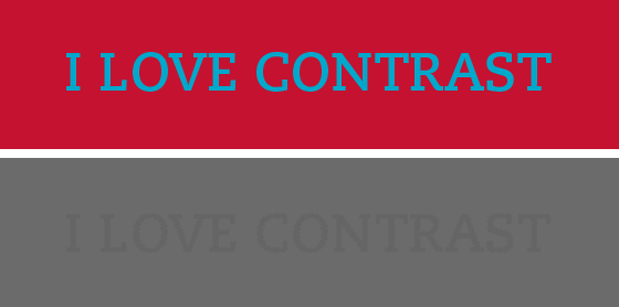
In the image below, even though the colors are very different, once
they are converted to grey scale, you can see that their values are so
close the words become almost impossible to read. This tells you these
colors are not a good pair.
A professor I had in college told me the trick was to squint your
eyes and if you could no longer differentiate the colors, you didn’t
have enough contrast.
If you design on a computer like most of us, it’s a bit more
technical, but just as easy. In Photoshop, after flattening your work,
select: Image>Adjustments>Desaturate. In Illustrator you do this
by selecting your design, then select: Edit>Edit Colors>Convert to
Grayscale.
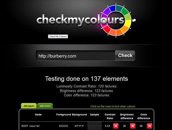
If you want to check the contrast on a finished website, use
checkmycolours.com.
As with any tool, this tool is only as good as the data it can read, so
don’t be shocked if it says your site has a few failures.
2. Font Size
Print design and web design differ here – mainly due their respective mediums.
In print design, 10pt font for body copy is generally accepted, but
on the web, we deal in pixels. The equivalent of 10pt is 13px and this
is a good size to stick with for body copy on the web. Anything smaller
than these sizes will be too small for the average viewer to read.
Of course, keep your audience in mind. If you’re designing a website
or brochure for a more mature audience, make your type bigger – your
viewer will be happy you did.
3. Leading
Leading is the space between lines of text – what web designers refer
to as line height. The word leading originated when type was set by
hand in printing presses. Lead strips were put between lines of type to
add space.
Without space between lines of type, it becomes difficult for the
viewer to read and follow from one line down to the next. Adding too
much space makes large sections of text tedious to read.
In print design, standard leading is 120% the point size of the font
(10 point type/12 point leading, 12 point type/14.4 point leading). In
web design, a good line height is also about 120%. In both print and web
design, this percentage can vary slightly based on the typeface used
depending on the x-heights, ascenders and descenders of each letter
form.
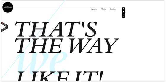
Many times, very tight or very open leading can yield beautiful
typographic treatments, but should be reserved for small amounts of
text, not large blocks of copy. This example from
neotokio.it demonstrates how tight leading can create a great typographic treatment for a header.
4. Kerning
Kerning is the process of adjusting the space between individual characters.
The goal of kerning is to achieve more balanced type – equalizing the
appearance of whitespace between characters. This is especially
important in headers and large type. While not as important in
paragraphs of small type, kerning can be quite functional when you’re
attempting to avoid line breaks in your design.
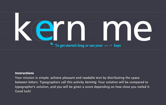
To test out or practice your kerning skills,
check out this website:
Kerning has, until recently, been mostly reserved for print designers
due to the difficulty of kerning for the web. There are now some easier
ways to kern for the web. One great tool is
kern.js.
5. Hierarchy
Web designers often establish typographic hierarchy by using the tags
<h1>, <h2>, and so on. Hierarchy isn’t size alone, but has
more to do with the prominence of your typographic elements relative to
each other.
This could be achieved by using a different typeface, a contrasting color, white space or size.
Achieving good hierarchy should generally start with a sketch where
you layout what your most important visual element is down to your least
important element.
The most important element doesn’t have to be larger, it just needs
to take more prominence over the other elements. Ask yourself what you
want the viewer to read first. This doesn’t have to be what is actually
first in your layout – it just needs to be the focal point.
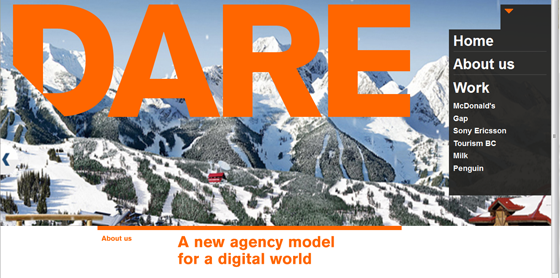
In this example, the home page of
thisisdare.com,
what is the focal point? “DARE” right? In this case, the focal point is
achieved with size and color, but where does your eye go next? I’d say
it goes to the bottom to find out what DARE is. The hierarchy here is
achieved by color and contrast despite its order in the composition.
What if the about us text were black rather than orange? The color
isn’t being used just for its aesthetic quality or to match the word
DARE, it’s being used intentionally to create hierarchy and lead the
viewer’s eye to where it should go next.
6. Whitespace
White space, or negative space, is the space between elements in a composition.
If your typography and other design elements are dense and too close
together, your content will become difficult to read. This is where
whitespace comes in.
I hear a lot of my clients telling me to fill in those empty spaces
or to not waste the space, but white space is a very intentional
component of good design. In 1930, Jan Tschichold wrote,
“White space is to be regarded as an active element, not a passive background.”
Whitespace can be used to create balance or lead the viewers eye from
one part of the composition to the next. It can invoke a feeling of
elegance or add a level of communication to a typographic treatment.
The FedEx logo uses the whitespace between the uppercase E and the x
to create a counterform – an arrow. This adds a secondary level of
communication to the word.

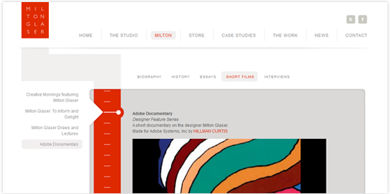
Milton Glaser’s
newly designed website
employs white space to add a feeling of simplicity and elegance, as
well as create positive and negative forms that lead your eye around the
content.
7. Serif vs. Sans Serif
Print designers have always debated which font is easier to read – serif or sans serif.
The truth is, there is no evidence to support that either one is more
legible than the other in print. Some say sans serif fonts should be
reserved for titles and headers and serif fonts should be used for body
copy, while just as many others say the exact opposite.
However, when dealing with web design or any kind of on-screen
design, it is generally agreed upon that sans serif fonts are easier to
read on screen. They should be used for the majority of text on screen
while serif fonts should be primarily used for small sections of copy
such as titles and headers.
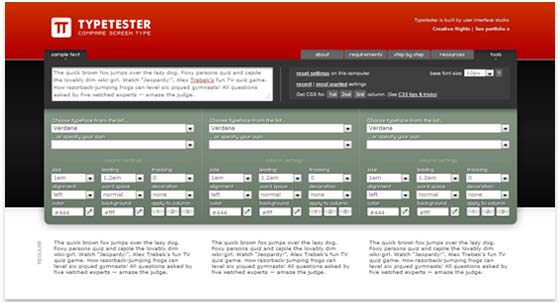
Typetester.org is a great tool to compare typefaces you’re considering for your website.
8. Using Webfonts
In the recent past, typography on the web was limited to web safe or system fonts.
If you were to design a website using the typeface Akzidenz-Grotesk,
hardly anyone would have it installed on their computer and as a result,
your visitors would see your text in Helvetica or more likely, Arial –
whichever typeface they had installed on their system. In a vain attempt
to compensate for everyone on every system (even the Linux users) we
would create fallback fonts on top of fallback fonts – a sort of Russian
Roulette for typefaces.
Today typography on the web is evolving. There are several
technologies which allow end-users to experience the fonts you intended
them to see. Some use font-replacement, WOFF, javascript or hosted
fonts. The list of technologies can get dizzying but it all boils down
to this: you can use non-system fonts and trust that your users will see
them. Usually, all you need to do is add a link in your <head>
and you are off and feeling free to code with confidence. You no longer
need fallback fonts in a webfont enabled world.
You can buy professional fonts with web-licenses from many online font distributors including
myfonts.com,
fontspring.com,
typekit.com and
typotheque.com.
Most sites have licensing options which allow for print and web use,
and they all allow for some sort of free trial period. If you’re just
starting out or don’t want to commit to a font financially, you can give
Google Webfonts
a try – it’s free. They have some decent fonts and simple installation
instructions. If you want to see your (or any) site with a font
facelift, try out the
font-swapper from
webtype.com.
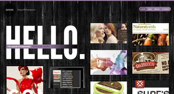
For a great example of webfonts in action, check out
adamstoddard.com.
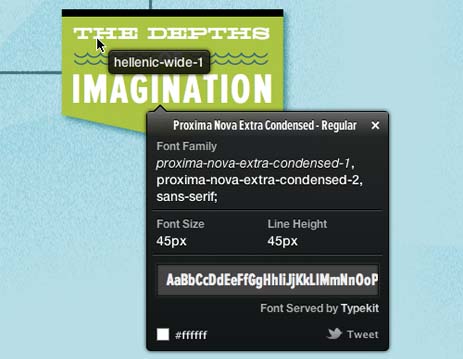
To find out what font is being used on a webpage, use the
WhatFont
bookmarklet/extension. WhatFont is easy to use – with just a click it
tells you what fonts are used in a webpage along with what size, color
and line height are used.
Understanding these basic typographic elements and applying them
skillfully to your print or web designs will enhance the readability for
your viewer and the quality of your design. Keep in mind design is a
creative process and treat these guidelines as a foundation for your
designs – not a set of rules to follow. It is also important to find a
printing company that is known for its attention to design elements and
details, such as
Asset Print – if you are in the Cape Town area. Happy designing!
Source – article :
http://blog.crazyegg.com/2012/01/24/typography-design-elements/